It’s happened to all of us: we select some of our favorite photos to print, and then wait for them to arrive. When they do, we open our packages only to be disappointed – the color on the images doesn’t match what we saw on our screens. So color matters in photography.
What’s the appealing color for a photo?
Color is comprised of saturation, temperature, and hue and the relationship between the three of them. These three elements of color work in harmony to help you get the right tonal balance for your images.
What is color correction?
Color correction is the process of adjusting image data, so the resulting picture looks realistic or as you remember it. What we see with our eyes is very different from the data captured by a digital camera.
Is there a quick way to correct the color?
There is an automatic online color correction tool called Cutout.pro. You can try it here.
- Step 1 Click this link. Then drag and drop the image you want to edit.
- Step 2 Wait for a second for it to process.
- Step 3 Download its result. You can download the low res result fo Free and even the paid result is only several dollars.
Simple isn’t it? They also support 9 languages worldwide.
What can this automatic color correction tool offer?
The automatic color correction tool fixes color balance, exposure, and contrast problems automatically in a single click.
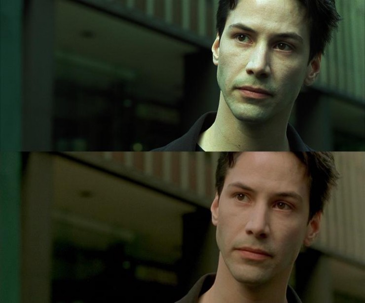
Let’s check some of their results. The following images are edited by Cutout.pro.
Use Color Correction for Changing Color Temperature.
What is Color Temperature?
Color temperature is generally understood as the color of light. Color temperature is the temperature at which a black body — an object that fully absorbs all frequencies of light — would emit radiation of the same color as any given object.
One concept associated with color temperature is white balance. Correcting for white balance (WB) is the process of removing unsightly color casts. You can use the RAW files in your camera and a bunch of tools to adjust white balance. That’s the conventional of doing it.
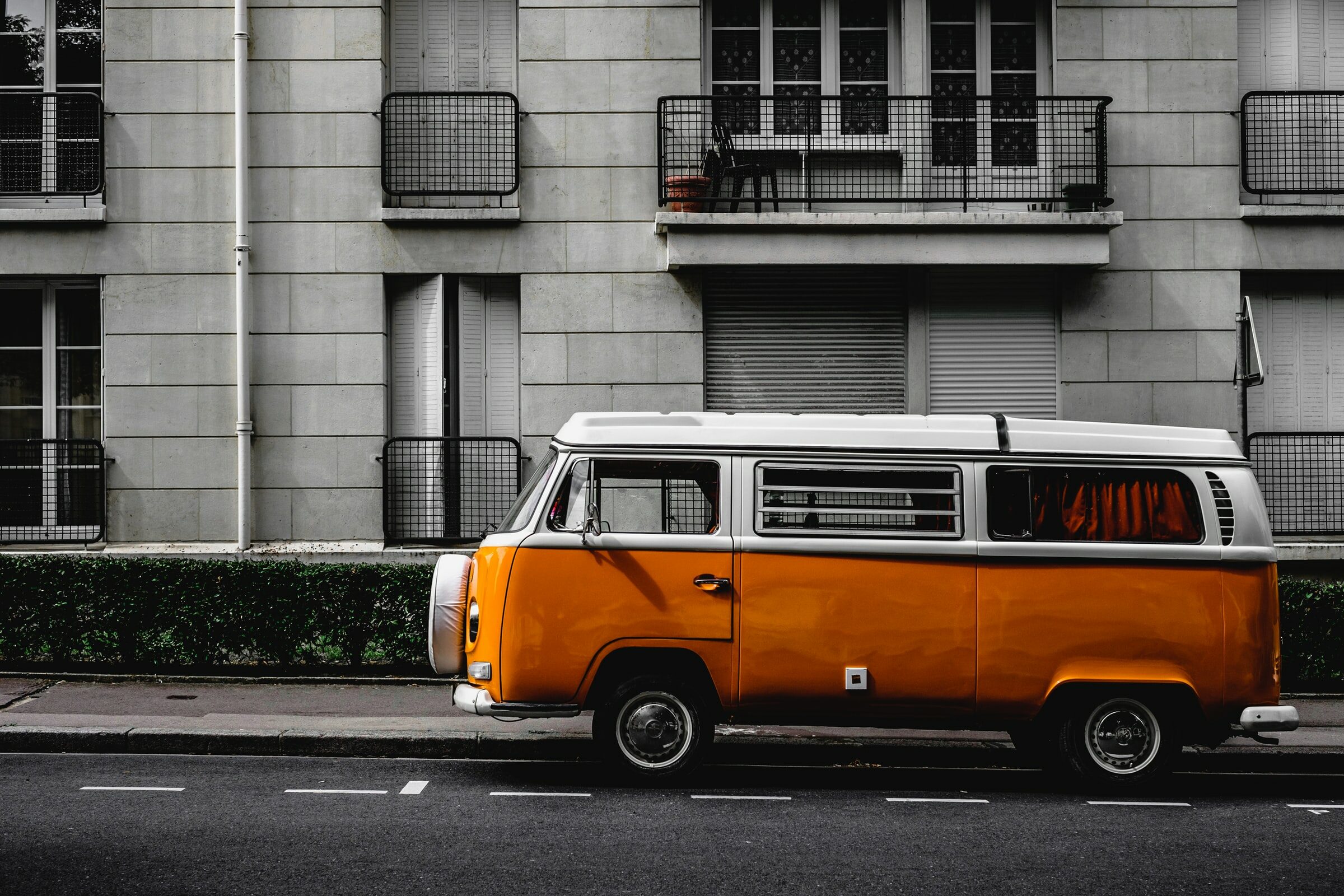
Color correction can really affect our feelings towards photos. For example in the images below, the candle and the glass container become more warm and comforting after being color corrected on the right.

Before 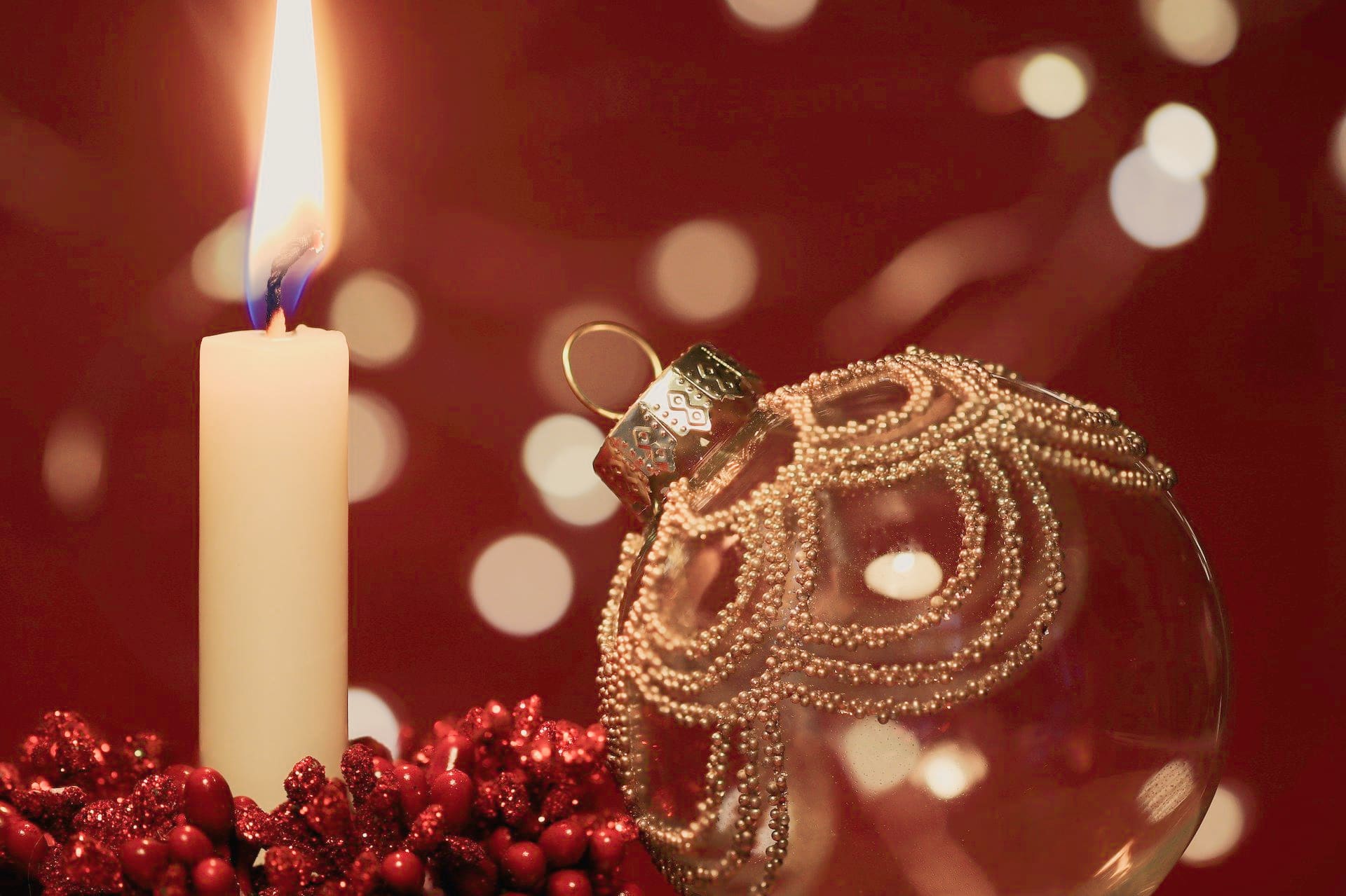
After
Before 
After
Before 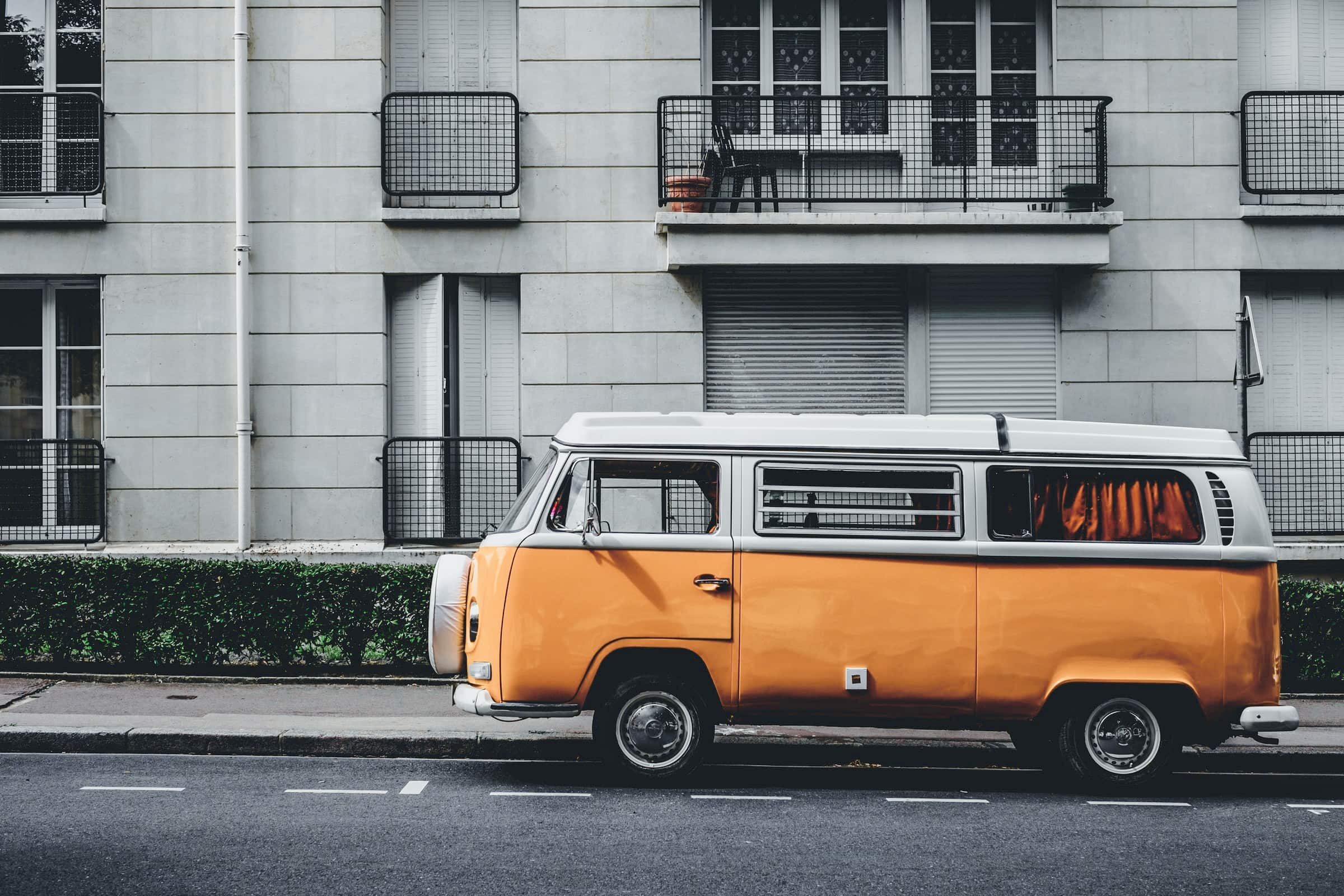
After
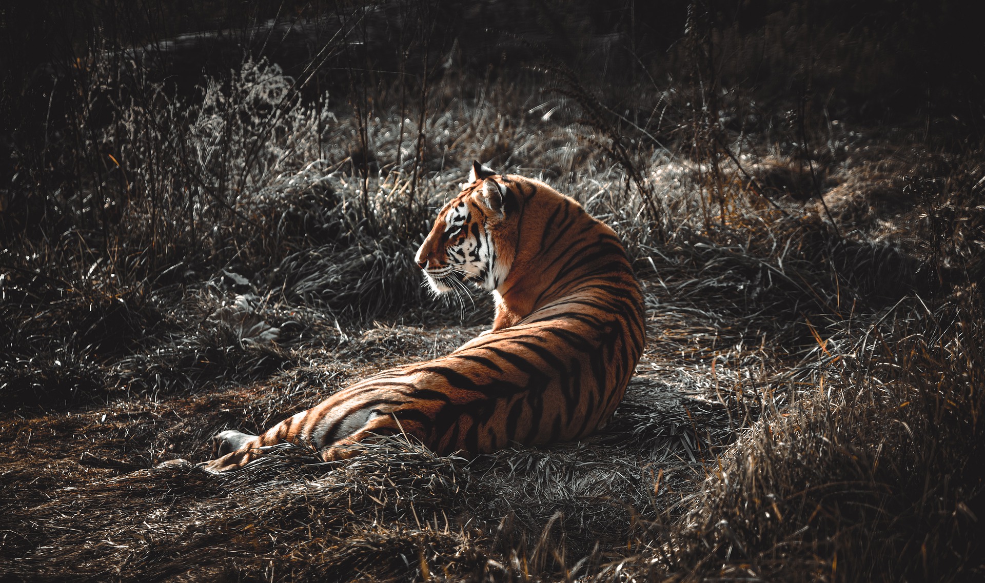
Use Color Correction for Improving Exposure.
What is exposure?
Exposure is one of the most fundamental photography word. When you take a picture, you press the shutter button to open a camera’s aperture, and light streams in, triggering a response from a sensor. Exposure is the amount of light that reaches your camera’s sensor, creating visual data over a period of time. That time period could be fractions of a second or entire hours.
You can also adjust exposure in post-processing. Try using the Adobe Photoshop Lightroom exposure slider to make adjustments or use automatic tool like Cutout.pro.
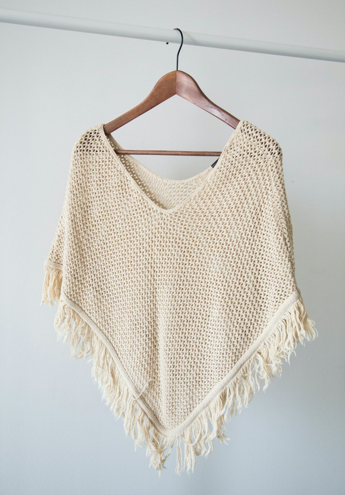
Before 
After
Before 
After
Color correction is used for more creative photography.
Before 
After
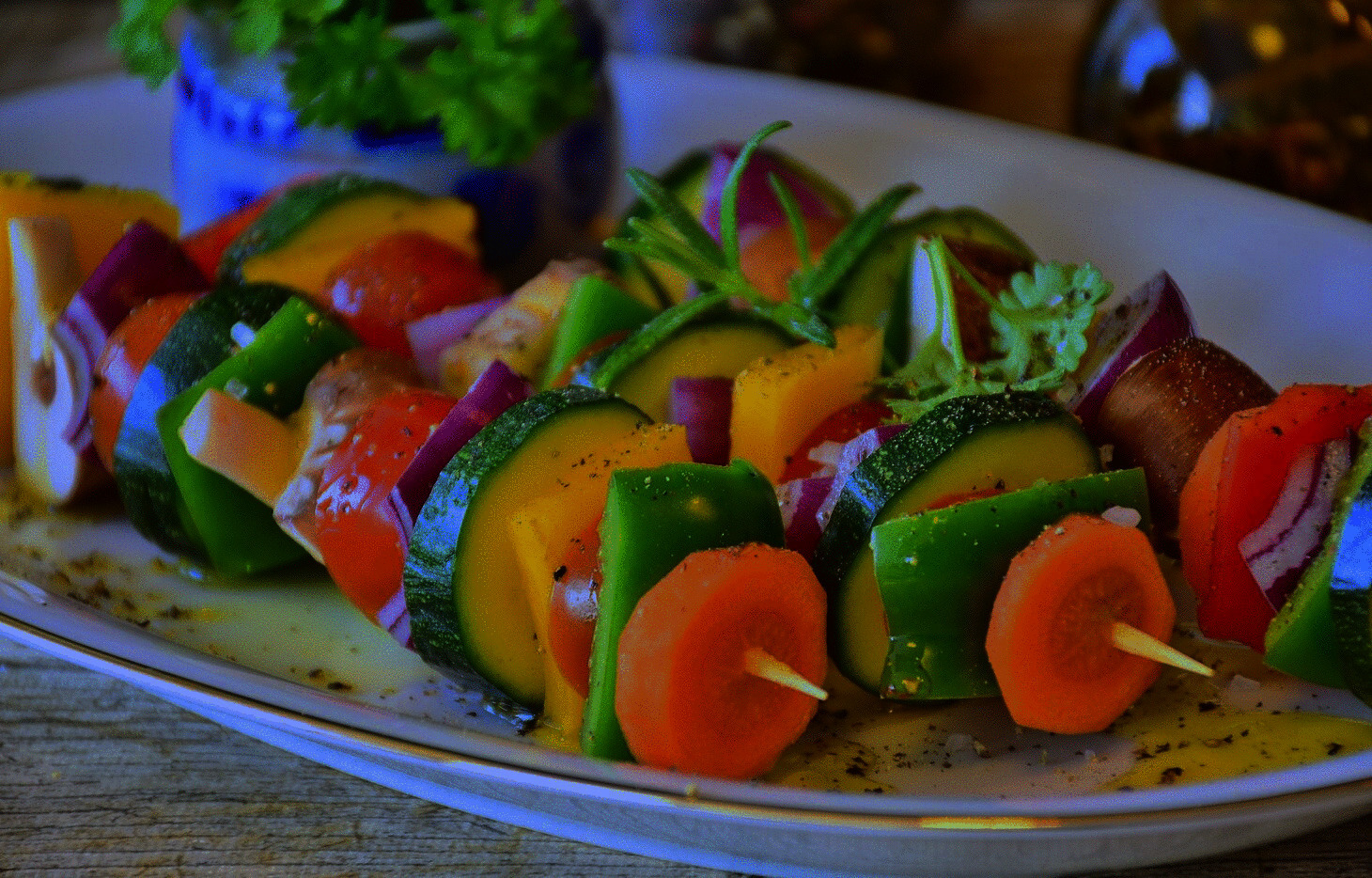
Use Color Correction for Improving Food Color Contrast
While exposure adjusts the lighting levels, white balance refers to the temperature of the colors in the image. Changing the white balance settings can radically change the color and appeal of the food in your photos.
Tastes vary and there are no real limits to how you can use color in your food photos. The most important thing to note is that the brightest, most colorful, or most highly saturated element of your scene is the one that will attract the viewer’s attention and determine the feel of the image.
Before 
After
Before 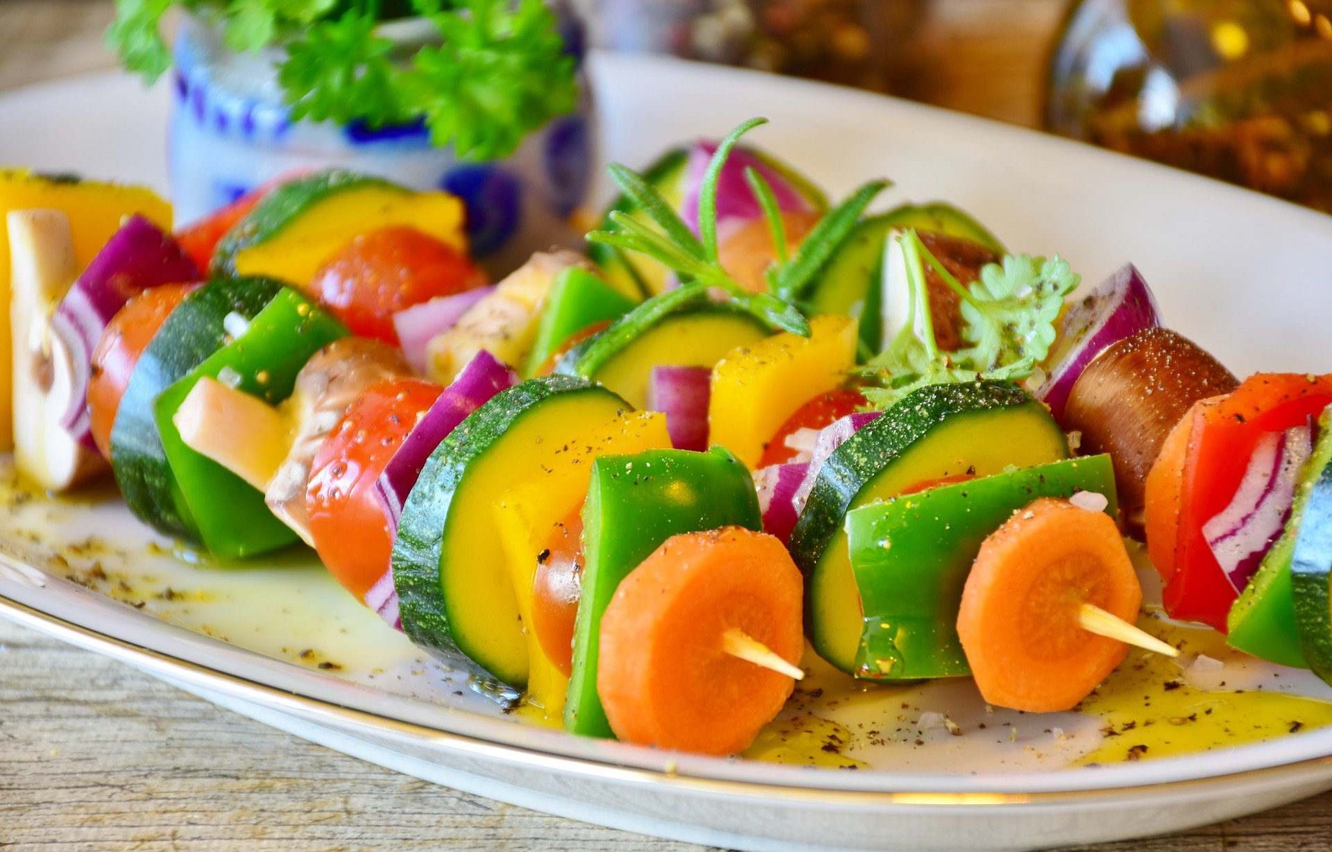
After
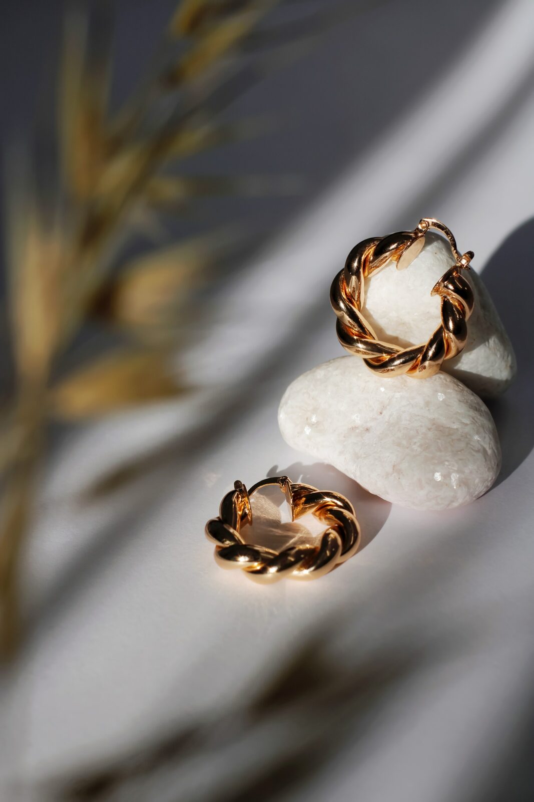
Use Color Correction for Creating Vintage Effect on products.
Vintage photography is created when photographers take pictures using film from another era, giving that photo a certain aged look. Fortunately, you don’t need expensive film and a 35mm camera to practice vintage photography.
Film cameras rarely achieved such saturation, so if you want to achieve a vintage look, the first thing you’ll have to do is tone down the color saturation. You can also adjust the temperature of your photo. Cool and warm-toned photos alike will give you a vintage look. So Cutout.pro Color Correction tool will generate vintage look product photos automatically through adjusting saturation, exposure and color.
Before 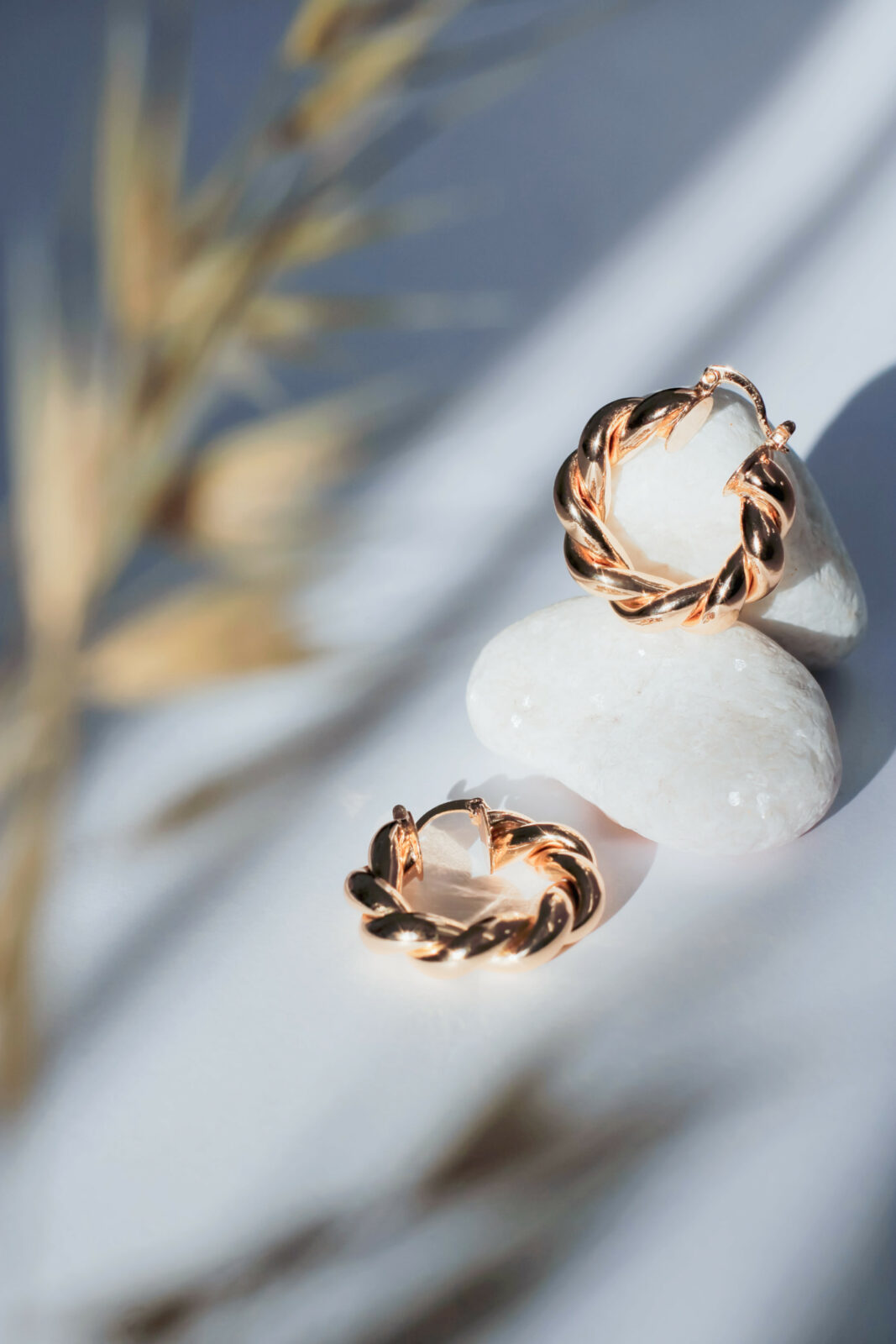
After
Before 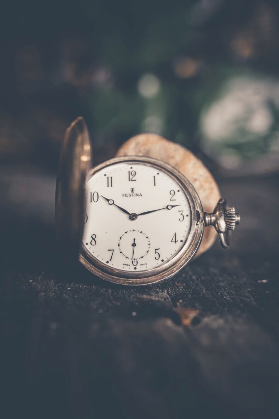
After
Before 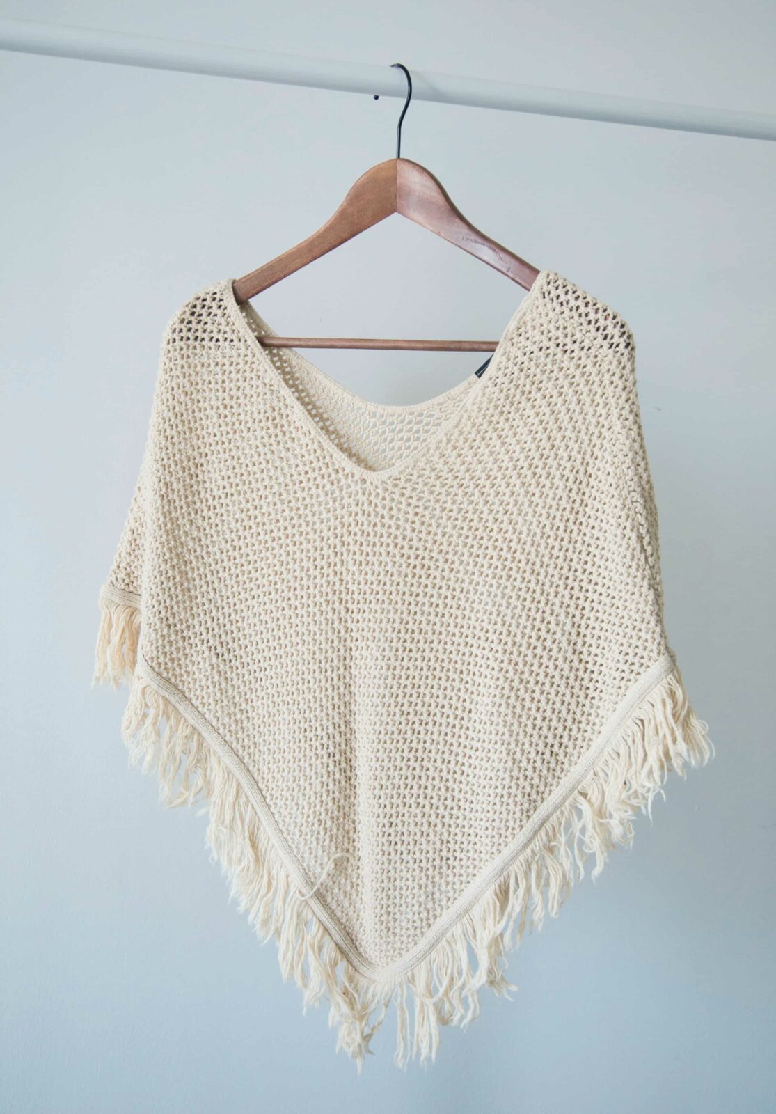
After
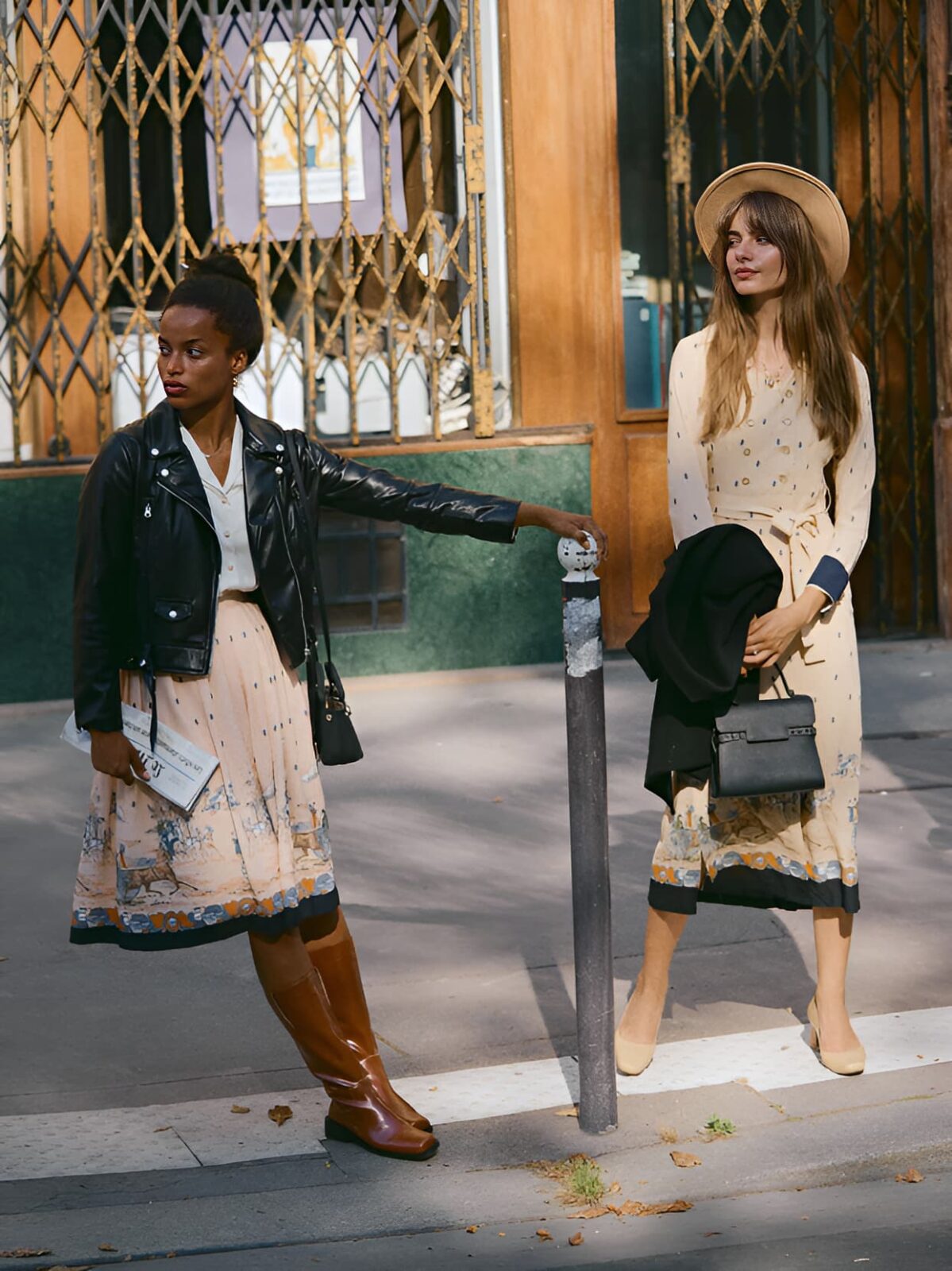
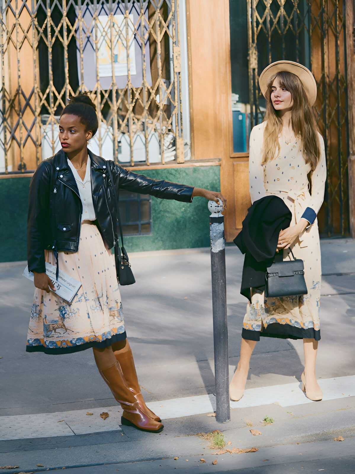
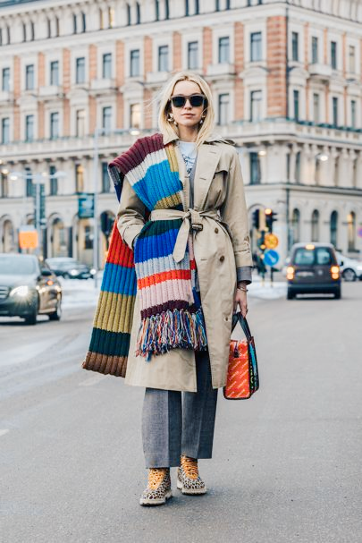
Use Color Correction for Creating Retro Style in Fashion.
The fashion meaning of retro refers to styles that are either copied or adapted from earlier periods. The retro reference was coined by London designers, and soon became a common coin throughout the fashion world. Thus the prefix for backward became a catchword for fashion in retrograde, fashion in retrogression-or retrospective fashion. While the word retro was “new” in the style context, the concept of bornagain fashion was not.
Modern cameras take incredibly sharp photos. But it never used to be that way: The cameras used back in the day had lenses that were less sharp and rendered much less detail, just like what we talked before about vintage products, the same principle applies to models and people who do vintage look in the fashion world.
Do you feel that the photos on the right side below may not be as saturated as the ones on the left and looks much “warmer” than the left? Well, that’s the key for creating Retro style. Every one can travel back in time with this trick now.
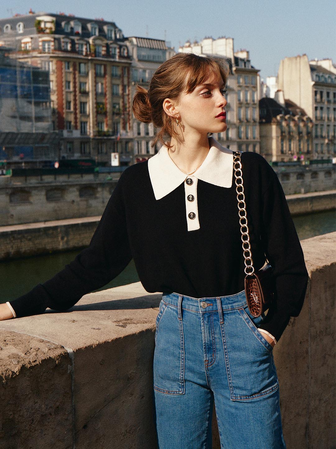
After 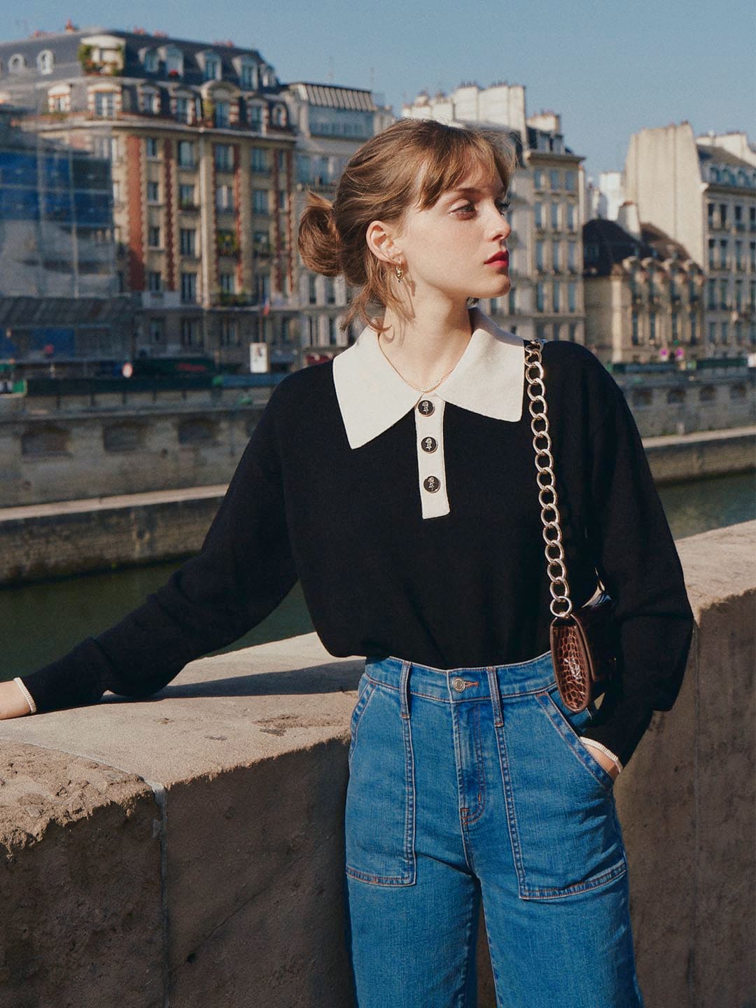
After
After 
After
Conclusion
Color correction is essential. It is not only used when photos are badly shot. Also in this digital age, how a photo appears on one screen – the back of your camera, your phone, your computer – can look different on another. So color correction is definitely something we have to deal with in the end. That’s all the tips today for using color correction tools. If you want to give it a try, you can click here.