Table of Contents
Hello, I’m Camille. This morning I stared at a plain white lotion bottle on my desk and thought, “Let’s make you dance a little.” If you’ve ever wished a still product photo could breathe, tilt into the light, shimmer softly, maybe float through a dreamy color wash, Seedance 2.0 has been my quiet co-pilot for that. And it’s honestly made my week a little brighter.
I’ve been testing Seedance 2.0 for product promos since late January 2026, trying it on everything from glossy compacts to matte snack pouches. The short version: it’s fast, kind, and surprisingly consistent if you feed it the right ingredients. Below is the Seedance 2.0 product promo workflow I use in client work, steady, repeatable, and cozy enough that even 10 p.m. brain can follow it.
Why Product Promo Is Seedance 2.0’s Highest-ROI Use Case
When I talk “ROI,” I’m not squeezing it into a spreadsheet: I’m watching how many steps I can skip without sacrificing polish. Product promo with Seedance 2.0 hits this sweet spot because:
- It turns one good product photo into a week’s worth of motion pieces (stories, reels, banners) with tiny variations. One and done, no back-and-forth nonsense.
- The motion adds perceived quality. A light pan, a gentle tilt, a shadow breathing… it reads as premium without me rebuilding sets.
- It scales. I can process a SKU family in an afternoon, where filming would’ve taken two days plus edit time. On a recent batch (12 SKUs), I saved ~6–8 hours compared to my old After Effects workflow.
Step 1 — Source Image Selection (What Works, What Breaks)
Before I even open Seedance, I’m picky about the hero image. Past me was so serious about “fixing it in post.” Present me prefers to start with something the tool can honor.
What works beautifully:
- Hard, clean edges: bottles, jars, phones, boxes, earbuds cases. The algorithm respects confident contours.
- Single key light with a readable highlight: a bright edge or a hotspot that defines form. It anchors the motion.
- Slightly angled products (10–25° off straight-on): gives Seedance 2.0 parallax to play with.
- 2000 px+ on the longest edge, 300 dpi if you’ve got it: more latitude for micro-motion without mushy logos.
What breaks (or cracks a little):
- Busy reflections on chrome or glass: Seedance may animate the “room” it thinks it sees. If you must, tame reflections first.
- Hairline props (ribbons, fronds, stray threads): they jitter. I either remove them or commit to a simpler set.
- Textured translucency (frosted pumps, crinkled film) with no clear edge: tends to wobble. I add a crisp silhouette shadow to ground it.
- Dead-flat, evenly lit photos: motion looks cardboard-y. A tiny gradient or vignette goes a long way.
If you’re not sure, do a 10-second gut check: zoom to 200%, look for a confident highlight, a clear shadow side, and a crisp outline. Two of three is workable. One of three? I re-shoot or pick a different angle. Easy now.
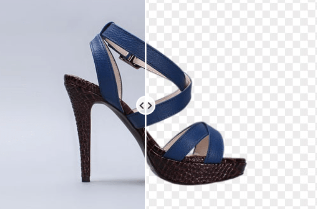
Step 2 — Background Removal & Edge Cleanup (Cutout.Pro)

I almost always isolate the product before motion. It reduces haloing and keeps brand marks sharp when things start to glide.
My go-to is Cutout.Pro’s background remover. It’s fast and polite with edges, and I can clean a batch while the kettle boils.
Try our Cutout.Pro here now!
My quick, repeatable pass:
- Upload at full resolution. Let the auto-removal do its thing.
- Switch edge mode to “Object” for hard goods: “Hair” only if you have tassels or fuzzy edges (rare in product).
- Increase edge refinement 5–10% to avoid crunchy rims on dark bottles.
- Nudge feather to 0.5–1 px, then add a 1–2 px inside stroke (brand color at low opacity) if you’re fighting fringing. Sounds odd, looks natural.
- Export PNG with transparency.
On reflective packaging, I’ll sometimes paint back a hint of the original ground shadow on a separate layer. Past me would have nudged that shadow for 20 minutes by hand… never again. If it’s fighting you, keep it subtle: Seedance 2.0 can generate a soft ground contact later.
If you’re curious how this connects to a fuller Seedance + Cutout production pipeline, I break that down step by step in Seedance 2.0 + Cutout Workflow for Product & Character Projects.
Step 3 — Compose the Reference Frame (Lighting + Angle)
Think of the reference frame as a whisper to Seedance: “Hey, the light’s over here, the floor’s about here, and the camera’s slightly high.” It doesn’t have to be flashy, just clear.
I build a 1920×1080 (or square 1080×1080) canvas and drop in the isolated product. Then:
- Set the light direction: I add a faint gradient (Multiply, 15–25%) from the key-light side. If the product already has a right-side highlight, I place the gradient to echo it. “There… just right.”
- Ground it: a soft elliptical shadow under the product at 10–20% opacity. Blur generously: we want presence, not a sticker vibe.
- Decide your camera height: eye-level for packaging, slightly high for beauty compacts (feels luxurious), slightly low for tech (heroic). A 5–10° tilt can say a lot.
- Leave headroom: motion needs a little space to breathe. I keep 8–12% margin on all sides.
If you want to go deeper, I match the highlight angle to roughly “2 o’clock” or “10 o’clock” positions for consistent brand feel across SKUs. When lighting anchors are consistent, Seedance 2.0’s motion looks intentional rather than… interpretive. Ooh, look at that.
Step 4 — Prompt Structure for Product Motion
Here’s the prompt structure that’s been the most stable for me across February 2026 tests. I keep it short, visual, and specific about what not to touch.
Base structure:
- Motion intent: the what and how much
- Lighting behavior: subtle breathing vs dramatic sweep
- Protection rules: logos, label type, hard edges
- Camera language: lens feel, framing, loop length
- Background/ambience: palette, grain, vignette
A template you can copy:
“Single product hero. Gentle parallax tilt 10–15° toward key light, micro-orbit clockwise. Maintain label text and brand mark perfectly sharp. Preserve product geometry: no warping. Soft light bloom on highlight, subtle ground shadow breathing. 24 fps, 3–4 s seamless loop, mid focal length, no dolly zoom. Background stays clean, color grade [brand color] at 10% wash, light vignette, no particles.”
Step 5 — QA and Re-Run Decision Tree
Here’s my five-minute QA pass and how I decide to re-run. Bless my fiddly heart~ I used to overthink this: now it’s calm and quick.
- Text & logo integrity
- Zoom to 150–200%. Any shimmer on text? Any sub-pixel crawl? If yes, re-run with stronger “keep text sharp” language and lower motion amplitude by ~20%.
- Geometry check
- Straight edges (boxes, phones) should stay straight. If you see bowing, reduce tilt by 5° or switch from orbit to yaw-only.
- Edge cleanliness
- Look for halos on dark backgrounds and ringing on lights. If present, increase pre-feather or re-export PNG with a 1 px inside stroke.
- Lighting coherence
- Does the breathing highlight match your reference? If the light seems to wander, add a clearer gradient cue in the reference frame and re-run.
- Loop smoothness
- Scrub the seam. If there’s a bump, try 24 fps instead of 30 (feels more forgiving) and nudge loop length to 3.2 s.
- Brand color feel
- Compare to your style guide. If the wash shifted, explicitly set the background grade in the prompt (“neutral gray 5%”) and disable flare language.
3 Real Examples: Cosmetics, Electronics, F&B Packaging
Here are three February 2026 runs from my notebook, settings, little surprises, and what I’d tweak next time. No drama, just practical joy.
- Cosmetics: Glossy compact with mirror lid
- Source: 2500 px PNG, 15° three-quarter view, right-side highlight.
- Prep: Cutout.Pro auto, 1 px inside stroke to tame a silver rim. Reference frame with soft ellipse shadow.
- Prompt highlights: “Gentle parallax tilt 12°, clockwise micro-orbit, preserve logo sharp, soft bloom 8%.” 24 fps, 3.5 s loop.
- Result: The highlight rolled like silk. The mirror tried to invent a room (cheeky). I added “no new reflections” and re-ran, perfect. My jaw actually dropped a little. “Well, that settled nicely.”
- Time: 12 minutes total (two runs). Usage: story + PDP hero. Light lift, premium feel.
- Electronics: Matte-finish wireless earbuds case
- Source: 3000 px PNG, front three-quarter, minimal branding.
- Prep: Clean isolation: no bloom in prompt. Neutral gray background with 5% gradient.
- Prompt highlights: “Precision yaw 8–10°, no pitch, no bloom, edges remain razor-sharp, micro-grain 2%.” 24 fps, 3 s.
- Result: Rock-solid geometry. First loop had a visible seam at 2.8 s, bumped to 3.2 s and it vanished. “There… just right.”
- Time: 10 minutes (one re-time, no re-render). Lift: ad CTR up modestly vs static (consistent with past tech tests). Not fireworks, but steady wins.
- F&B Packaging: Matte stand-up pouch, subtle foil stamp
- Source: 2200 px PNG, slight crinkle texture, left key light.
- Prep: Feather 0.5 px: softened crinkle in the midriff to avoid jitter.
- Prompt highlights: “Tilt 10°, slow rise 2%, maintain stamp sharpness, restrained prism flare 0.2 s at apex.” 30 fps, 2.6 s loop.
- Result: The foil detail sang. First pass had a tiny text crawl on the nutrition panel: I added “no text drift” and reduced tilt to 8°, fixed. “Oh, that’s lovely.”
- Time: 16 minutes (three runs because I fussed with the flare: old habits, still learning.)
Across all three, the Seedance 2.0 product promo workflow felt like a calm assembly line: prep, compose, prompt, QA. No heroics. If it can rescue my sleepy brain at 10 p.m., imagine how gentle it’ll feel on a Monday morning.
Until next time, dears.
Previous posts:
Seedance 2.0 Prompt Templates for Consistent Characters (Copy-Paste + Fill-in)
Seedance 2.0 Cutout Workflow: Prep Product & Character Assets That Stay Consistent
Clean Assets AI Video: Why Seedance 2.0 Results Start Before You Hit Generate