Table of Contents
Hello, I’m Camille. This morning I stared at a blank product mockup and thought, “Not today, perfectionism…” Then I opened my Seedance 2.0 prompt template folder, clicked one, and, there we go~, a clean, on-brand visual in minutes. I’ve been testing Seedance 2.0 across a handful of real client briefs (e-commerce hero shots, social covers, and a couple of cozy motion loops).
If you want visuals that look like you made them on purpose (not just “something the model cooked up”), this is my exact setup: three Seedance 2.0 prompt templates and one simple prep checklist that shave off 20–40 minutes per deliverable while keeping quality steady. Let’s walk it together, gently, step by step.
Why Templates Beat “Clever Prompts” for Consistency
I used to chase clever prompts like a magpie collecting shiny words. Some days they sparkled: other days… let’s call it abstract art. Then I started versioning prompts the same way I version design files, locked pieces, clear variables, and notes on what each part controls. The results got calmer and more reliable fast.
Here’s why a Seedance 2.0 prompt template works better than “winging it”:
- Repeatability across batches: When you’re rendering 12 colorways or three product angles, copy/paste with named variables beats improvising. My character/brand identity stays intact across outputs, so nothing feels off-brand or uncanny.
- Faster iteration: I keep core bones fixed, identity, camera, lighting, and only swap variables (outfit color, surface, copy line). Each change is surgical, not a rewrite.
- Cleaner feedback loops: Clients can point to one variable (“Let’s soften the key light by 20%”) instead of vague “It feels different.” You can adjust a single element without domino effects.
- Fewer surprises: Surprises are great in sketchbooks, less great in final deliverables. Templates give you that quiet “Ahh, that’s nicer.”
Field note from last week: I did a 15-asset social set for a candle brand. Template workflow cut my time from 4 hours to 2.5, and more importantly, everything looked like one family, same cozy cream highlights, same gentle camera move, no oddball frames. Past me was so serious: present me just smiled and moved on.
Practical tip: Treat your template like a mini style guide inside the prompt. Label your blocks clearly (IDENTITY, LIGHTING, CAMERA, TEXT SAFETY), and leave one short line for variables per block. Seedance 2.0 respects clarity. So do future-you.
Template 1 — Character Lock (Identity + Outfit + Lighting)

When I need a recurring persona, brand mascot, recurring avatar, or the same model across a carousel, this keeps the face, hair, and general vibe steady while I play with outfits and environments.
What I lock:
- Identity backbone: age band, face shape cues (soft oval vs. angular), hair length/style, key accessories that won’t move (e.g., silver hoop, fringe). Keep it human, not hyper-detailed.
- Outfit slot: color, fabric, silhouette, described in broad strokes (“linen button-up, relaxed fit, sage green”). Avoid stacking too many trend adjectives.
- Lighting recipe: two lines, max. One for key (“soft window light from camera-left”) and one for fill or rim. If needed, a mood word (“calm morning”).
Why it matters: Seedance 2.0 handles identity cues well when you don’t compete with yourself. If the identity block says “short wavy brunette, gentle oval face,” don’t later say “platinum bob.” Keep the identity quiet and precise: shift the outfit instead.
Signals from my tests:
- Stability across 6+ renders in a row improved when I reduced face-related descriptors to 2–3 lines. Over-describing pulled the model in weird directions.
- I saved ~18 minutes per batch by locking lighting to a single recipe. I only nudged exposure once (bless my fiddly heart~).
Little structure you can adapt:
- IDENTITY: “late-20s woman, soft oval features, short wavy brunette hair, subtle silver hoop earrings: calm, approachable expression.”
- OUTFIT: one-line swap (e.g., “sage linen shirt, relaxed fit: warm brown trousers”).
- LIGHTING: “soft window key from camera-left: gentle fill: warm morning tone.”
- BACKDROP: “neutral paper sweep, light beige: no clutter.”
Reader note: It won’t clone a real person unless you provide allowed, explicit references and permissions (please do). For brand avatars, I use a consistent base render plus tiny outfit swaps: it keeps the feed feeling human and coherent. And sometimes, ooh, look at that, the colors align on the first try. Well, that settled nicely.
Template 2 — Camera Move (Push-In, Pan, Handheld)
This is my pocket template for short loops and micro-ads. The goal is to direct motion without writing a film essay. Seedance 2.0 reacts best when movement lives in a single, unmistakable line.
Core idea: Write ONE motion verb, ONE direction, and ONE pace. Then lock framing and stabilization separately. When I tried cramming “pan, tilt, dolly” together, the model did a polite shrug.
What I lock:
- Shot type: “medium close-up” or “tabletop product, 45°.”
- Camera move: a single motion cue (e.g., “slow push-in”) with a pace word (“gentle,” “steady”).
- Stabilization note: “stable, not handheld” or “subtle handheld sway.”
- Timing hint: “2–3 sec loop,” if your pipeline respects duration cues.
Simple structure:
- FRAMING: “tabletop shot at 45°, product centered: shallow depth-of-field: soft bokeh in background.”
- MOVE: “slow push-in toward center: stable, no shake.”
- LIGHTING: “soft top light + warm bounce from front: specular highlights controlled.”
- MOOD: “calm, refined.”
Field note: A jewelry loop that used to take me three re-renders now lands in one or two. I keep the move cue short and explicit (no more poetry), and suddenly the reflections behave. Mmm, that feels good.
Keep Motion Cues Short and Explicit
Think billboard copy, not a director’s memo. My winning lines:
- “slow push-in: stable.”
- “gentle left-to-right pan: stable.”
- “subtle handheld sway: micro-jitter only.”
Each time I added flourish (“graceful cinematic arc across the sunlit scene…”) I lost control of speed. Past me would’ve fussed for an hour: present me just writes six words and ships. Dora’s take: Looks good? Ship it.
Template 3 — Product Demo (Logo-Safe, Readable Text)
Product visuals fall apart when logos warp or mock packaging text melts into soup. I learned (the hard way) to template for safety first, then style.
What I lock:
- Logo safety: “logo front-facing, unwarped, unobstructed: keep edges crisp: do not stretch.” Add “orthographic feel” if your tool respects it.
- Text readability: “realistic label, high legibility: no nonsense words: avoid micro-text.” I only allow 2–3 label lines in the prompt to reduce hallucinations.
- Surface and shadows: “neutral matte surface, soft contact shadow: no mirrored reflections” when I need consistent ecommerce looks.
- Color constraints: I define brand color by hex when possible and repeat it in one other place (“accent stripe in [hex]”). Helps Seedance stick to brand.
My structure:
- PRODUCT: “matte glass bottle, 250 ml: pump cap: brand color [#B4D1C8].”
- LOGO/TEXT SAFETY: “logo front-facing, unwarped: label text clear, minimal: no tiny disclaimers.”
- LIGHTING: “45° key from camera-right: soft fill: tight specular control on glass.”
- BACKGROUND: “pale warm gray sweep: clean gradient: no props.”
Results from a February set: 9 SKUs, two angles each. With the template, I spent ~12 minutes per SKU (including small color nudges) vs. my old 25–30 minutes doing retouches for label distortion. Not magic, just fewer ways for things to go sideways. And when the first angle popped out crisp, I literally whispered, “Oh, that’s lovely.”
Clean-Reference Checklist Before Generation
Templates are half the story: clean references are the other half. Whenever I skip this, I pay for it later in masking time. Here’s my quick pass that consistently trims 10–20 minutes from post.
My preflight (adapt as you like):
- Source clarity: Use the sharpest reference you have. Slight motion blur multiplies weirdness.
- Edges: If you’re compositing, ensure edges are crisp and non-feathery. Stray hairs? Decide: natural flyaways vs. tidy silhouette. Don’t mix signals.
- Lighting agreement: Reference light direction should broadly match your template’s key light. If your reference screams “harsh noon,” but your prompt wants “soft window,” pick one. The model thanks you.
- Background noise: Remove busy backgrounds before generation if you plan a sweep backdrop. Fewer objects = fewer hallucinated props later.
- Scale clue: Include one scale anchor in the prompt (“hand-sized,” “12-oz bottle,” “desk lamp height”). It stops the model from turning tiny into giant.
Field notes: On two recent apparel runs, this preflight + Template 1 cut reject renders by a third. Less cleanup, more calm. Easy now~
How to Prep Cutouts in Cutout.Pro for Each Template
When I’m short on time, I run references through our Cutout.Pro Background Remover first. It’s quick and handles flyaways decently.
Try Cutout.Pro here now!
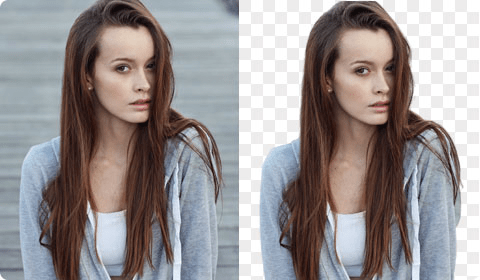
- For Character Lock: Use the AI portrait mode, then manually restore key details (earrings, wisps) with the restore brush. Export as PNG with a soft 1–2 px edge to avoid the paper-doll look.
- For Camera Move loops: Keep a bit more padding around the subject so push-ins don’t reveal empty edges. I’ll export at 1.2–1.5× target resolution for safer reframing.
- For Product Demo: Switch to “product” segmentation, refine around logos and caps manually. If the base plate shadow is nice, I keep it on a separate layer for grounded composites later.
Why it matters: Clean inputs reduce the model’s guesswork. On my last skincare set, prep cutouts alone removed three usual steps, edge cleanup, logo warp fix, and rogue background specks. There… just right.
Previous posts:
Clean Assets AI Video: Why Seedance 2.0 Results Start Before You Hit Generate
Remove Video Background Without Green Screen: A Practical Guide
Remove Background from Signature: Create a Clean Transparent Stamp