Table of Contents
Long time no see~ I’m Camille.
Have you ever dug up an old product photo, squinted at it, and thought — “I remember this looking so much better”? That was me last week, staring at a 640×480 shot I’d been meaning to rescue for months. Fifteen minutes later, it was sharp enough to post. No drama, no marathon Photoshop session.
Upscaling an image to HD is less mysterious than it sounds — once you understand what HD actually means, what your upscaler is doing under the hood, and where things tend to quietly go wrong. Let me walk you through it. If you’re comparing different tools before deciding which one to use, this guide to the best AI photo editors for improving image quality breaks down several popular options and what they’re best at.
What “HD” Means (Pixels + Use Cases)
“HD” gets thrown around a lot. It quietly means different things depending on where your image is headed.
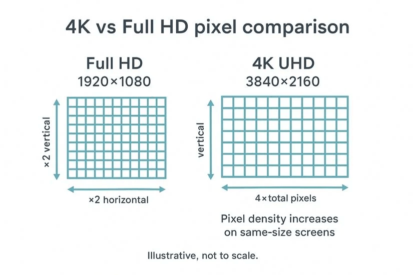
At its core, HD is a pixel conversation. Standard HD is 1920×1080 pixels. Full HD (FHD) steps that up meaningfully; 4K (3840×2160) quadruples it. But the number of pixels and the density of those pixels are two separate questions — and they matter in completely different contexts.
For screen use — social media, websites, presentations — displays only care about raw pixel count. As the University of Michigan Library’s image resolution guide explains, web images displayed at the same pixel dimensions will look identical on screen regardless of their PPI value — because browsers render by pixel count, not by PPI metadata. Chasing a high DPI number for a web image is largely wasted effort.
For print, the rules shift entirely. According to Adobe’s official print resolution documentation, 300 pixels per inch is the industry standard for producing high-quality prints — images appear sharp and detailed at this resolution, especially when viewed up close. If your image is heading to a product label, brochure, or campaign print, you need real pixel density, not just large dimensions.
Quick rule of thumb: know your destination before you start. An image going to Instagram and one going to a print shop have very different needs.
Choose 2x vs 4x Upscale
The first decision most AI upscaling tools ask you to make is the multiplier. Bigger feels better — but it isn’t always.
Social Use
For social posts, profile graphics, or web banners, 2x upscale usually hits the sweet spot. You’re taking something like 800×600 up to 1600×1200, which covers most modern screen sizes comfortably. Over-upscaling for web can actually work against you: it inflates file size and can introduce subtle over-smoothing that makes faces look just slightly too perfect — technically fine, but oddly unconvincing.
Print Use
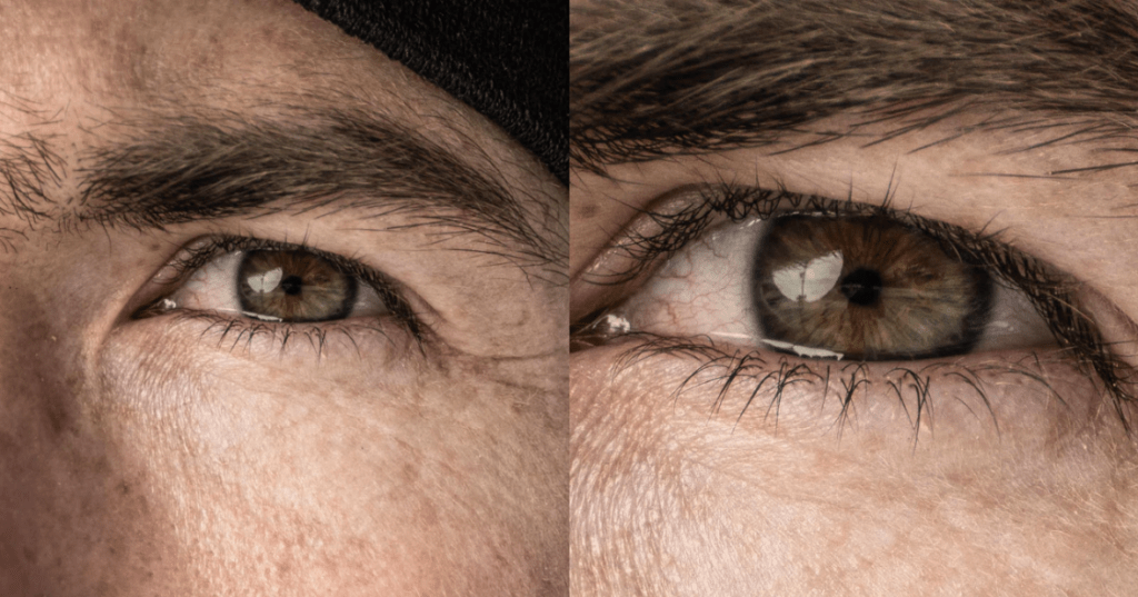
Print is where 4x earns its place. If you’re working from a mid-resolution source that needs to reach large-format dimensions, a 4x AI upscale is doing genuinely useful work. Modern AI upscalers reconstruct plausible texture based on patterns learned from millions of training images — on fabrics, product surfaces, and portraits, the results can be convincingly sharp.
Honest caveat worth keeping: no upscaler creates detail that wasn’t there. It synthesizes plausible detail. For most commercial applications, that’s completely sufficient. For forensic or archival purposes, it’s a different conversation.
Step-by-Step Upscale Workflow
Upload
Start with the highest-quality source you have. If the original is blurry or heavily compressed, the upscaler will faithfully enlarge those problems too. A lightly compressed JPG at 1200×900 will upscale more cleanly than a severely compressed 800×600 of the same image — the quality going in matters more than most people expect.
If you want to experiment with these techniques yourself, you can start with a free AI photo editor that supports upscaling and enhancement before moving on to more advanced workflows.
Select Upscale Level
Match your multiplier to the destination:
- Social media / web headers → 2x
- E-commerce product images (with zoom) → 2x to 4x
- Print up to A4 → 2x to 3x
- Large-format print (posters, banners) → 4x
If the tool offers a preview, always use it. Thirty seconds of preview saves you from the slow disappointment of downloading a large file and discovering the skin tones look slightly painted.
Export and Check Detail
Zoom to 100% — actual pixels, not “fit to screen” — and look at the most demanding areas: fine hair strands, text if present, fabric weave, any background that should have natural grain. These are where artifacts cluster first. If the image holds up at 100%, it will look good everywhere else.
Common Upscale Problems
Most upscaling artifacts fall into a small, predictable set. Once you recognize them, they’re easy to spot — and often straightforward to address.
Plastic Skin
The most recognizable AI upscaling artifact: skin tones that look eerily smooth, almost poreless, like a doll’s face under studio lighting. It happens when the AI over-applies its smoothing patterns to human skin, flattening natural texture into something that reads as subtly unreal.
Fix: Look for a “detail enhancement” or “texture strength” slider and nudge it upward slightly. Even a modest increase brings back convincing skin texture without tipping into over-processed territory. Some tools also allow region-specific sharpening after the upscale.
Edge Ringing
Ringing appears as a faint halo or double-edge around high-contrast boundaries — the outline of text, a product edge against a white background. It’s typically caused by aggressive sharpening applied during the upscaling pass.
Fix: Reduce sharpening intensity if your tool allows it. Alternatively, apply a very light Gaussian blur (0.3–0.5 radius) to the affected edges before selectively re-sharpening. It takes about 90 seconds and makes a clear difference.
Text Artifacts
Upscaling images containing text is genuinely tricky. AI models trained on photographic content can soften or subtly distort letterforms — especially at small type sizes.
Fix: For images where text legibility is critical — product labels, packaging mockups — consider compositing the text as a separate layer at native resolution rather than relying on the upscaler to reconstruct it cleanly.
Export Settings (PNG / JPG / WebP)
Getting the upscale right is half the work. Exporting it well is the other half — and this is where a surprising number of people quietly undo everything they just created.
PNG is the right choice when transparency is needed (product cutouts, logos against variable backgrounds) or when the image contains text or sharp graphic elements. It’s lossless — every pixel is preserved exactly. The tradeoff is larger file sizes. For print exports, PNG at full resolution is always the safest call.
JPG remains the workhorse for photographs and detailed product images where transparency isn’t required. It handles gradients and tonal transitions gracefully, and for most e-commerce or social use cases, a quality setting of 85–90 gives you a clean, lightweight file.
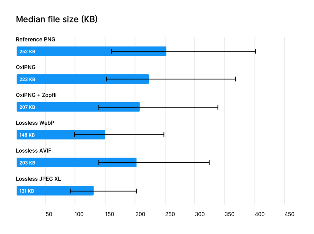
WebP is increasingly the smart default for web delivery. According to Google’s official WebP format documentation, lossless WebP images are 26% smaller than PNGs, while lossy WebP images are 25–34% smaller than comparable JPEGs. All modern browsers support it. If your platform accepts WebP, it’s an easy, nearly invisible win for page performance — and the Google WebP compression study confirms these gains hold consistently across diverse image types.
For print, always export as PNG or TIFF at full resolution. Never send a compressed JPG to a print shop — the artifacts that are invisible on screen have a way of showing up in ink. If you’re processing a large number of images — for example product catalogs or marketing assets — workflows like batch image background removal can dramatically speed up your editing pipeline.
FAQ
Does upscaling add real detail, or is it guessing?
Mostly the latter — but it’s well-informed guessing. Modern AI upscalers synthesize plausible texture based on patterns learned from large image datasets. For commercial use (web, social, e-commerce, light print), the results look convincingly sharp. For applications where accuracy of fine detail matters, treat the output as enhanced interpretation, not verified fact.
What’s the best source format to feed into an upscaler?
The highest-quality version you have. PNG or an uncompressed file will give cleaner results than a heavily compressed JPG, because the upscaler isn’t working around pre-existing compression artifacts. If you only have a JPG, use the least-compressed version available.
Can I upscale a screenshot or design mockup?
Yes, with caveats. Screenshots with text often upscale reasonably well in terms of overall sharpness, but letterforms can soften at small sizes. For design assets headed to print or large-format display, recreating them at target resolution from source files is almost always the better path.
How large can I realistically upscale before results noticeably degrade?
A clean 4x upscale from a reasonably sharp source is well within what current AI tools handle gracefully. Going beyond 4x from a small or compressed source tends to produce results that look “painted” — smooth and plausible, but not quite photographic. For extreme enlargements, a staged approach — 2x, then 2x again — sometimes retains more natural texture than a single large-jump upscale.
Will upscaling fix a blurry photo?
Not in the way most people hope. Upscaling increases pixel count; blur is information loss — the sharpness simply isn’t there to recover. Some AI tools combine deblur and upscale into a single workflow, which can partially restore soft edges, but it’s a separate process from straightforward upscaling. Without dedicated blur correction first, a blurry image will become a larger blurry image.
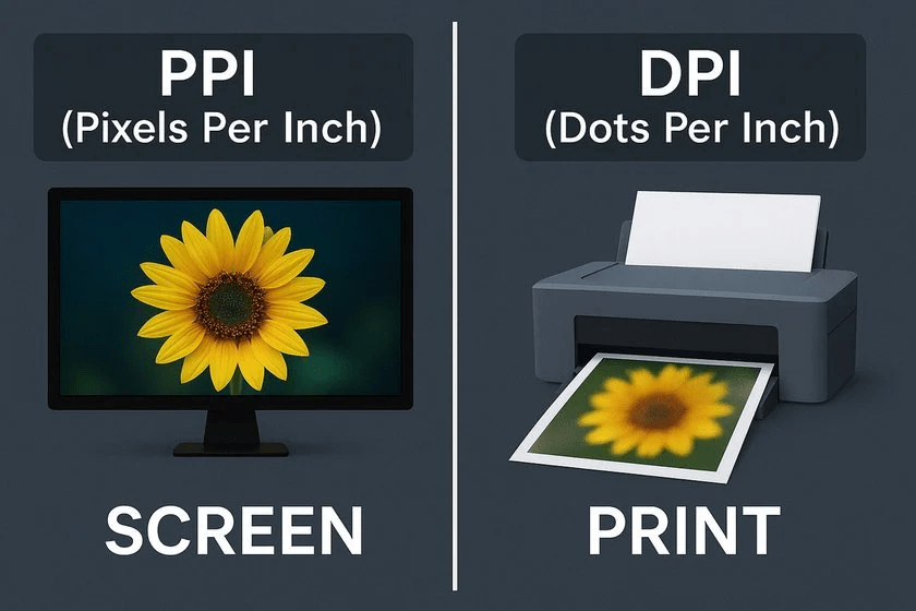
What’s the difference between PPI and DPI, and why does it matter when upscaling?
PPI (pixels per inch) describes your digital image’s resolution; DPI (dots per inch) describes how a printer lays ink on paper. As Adobe’s complete PPI resolution guide explains, 72 PPI is the web standard while 300 PPI is the print benchmark — knowing which world your upscaled image lives in shapes every decision you make, from multiplier choice to export format.
There — that wasn’t so hard, was it?
Once you know where the image is going, pick a sensible multiplier, check the result at actual pixel size, and export in the format that fits the destination. That’s genuinely most of it. The rest is just practice, and noticing that small satisfying moment when a tired old image comes back looking like it was shot this morning.
Here’s to more of those moments. Keep it light, keep it lovely.
Previous Posts:
Fix Blurry Photos: How to Sharpen Without Overprocessing
Photo Enhancer: What It Actually Does (Sharpness, Noise, Upscale)
Remove Background from Product Photos for Amazon, Etsy & Shopify (Standards + Workflow)