Hi, I’m Camille. Have you ever spent way too long trying to make a logo edge look clean? Same. This week I opened a coffee brand logo for a winter promo and thought, “Not today, perfectionism…” Then I tried a few background removers, a vector export, and a tiny edge pass. There we go. It all clicked into place.
I’m sharing how I remove background from logo files quickly without weird halos, color shifts, or crunchy edges, so your transparent PNG actually looks silky on any background. These notes are from work I did in January 2026 across Photoshop, Figma/Illustrator, and a couple of API tools. No sponsorships here, just my real workflows, what held up under deadlines, and where things can wobble a bit.
Logos vs Photos: Different Failure Modes
Logos aren’t photos, and removal tools treat them differently. Photos are messy, soft hair, shadows, gradients, so AI background removers try to guess contours. Logos are usually crisp shapes with solid fills. When you run a photo-first tool on a logo, you can get:
- Unwanted anti-alias halos: a pale fringe around the logo where the tool “softened” edges like it would on hair. On white or black backgrounds it’s obvious.
- Rounded corners that shouldn’t be rounded: the model tries to make organic edges, and your geometric logo gets… friendly. Not ideal for brand integrity.
- Subtle color contamination: your brand red (#E3262E, for example) picks up background white or gray, becoming washed out.
With photos, I forgive softness. With logos, I want pixel-crisp edges or true vector paths. That’s why the smartest path is usually: go vector if you can, or use removal tools that respect hard edges.
Field note: in my January 2026 tests, Photoshop’s built-in Remove Background behaved nicely on big, high-contrast marks but introduced halos on small wordmarks at 2x social sizes. Figma exports stayed truest when I stayed in vector and exported SVG > PNG only at the final size. Ooh, look at that, consistency saves time.
Best Source File Choices
Start with the cleanest possible source. It decides whether you’re done in one minute or twelve.
High-Res PNG vs Screenshot
If you have a choice, grab:
- Original vector (AI, EPS, or SVG) from your brand kit. This is the dream. Export a transparent PNG straight from vector. One and done, no back-and-forth nonsense.
- High-res PNG with transparency. If it’s already cut out, you’re already home.
Avoid screenshots. They look fine on your desktop but introduce compression blocks and gray “frosting” around edges. When I tested a 400 px-tall screenshot vs a 2000 px vector-exported PNG, the screenshot needed two rounds of cleanup and still looked fuzzy at 100% zoom. The PNG from vector? There… just right.
Pro tip: if all you have is a low-res raster, upscale first before removal. Even 1.5–2x via a decent upscaler reduces stair-stepping around diagonals. Keep it gentle.
Solid vs Gradient Background
Solid backgrounds (pure white or black) are easiest to knock out. But beware: a nearly-white gray (like #F7F7F7) can leave a faint outline. Gradient backgrounds are trickier, automatic removers sometimes interpret the gradient as part of the logo if contrast is low.
Practical fixes:
- If you’re in Illustrator or Figma with original art, turn off or delete the background layer and export with transparent background.
- If you’re stuck with a gradient photo of a logo (it happens), use a vector trace on a high-res version to rebuild clean edges, or isolate channels with strong contrast before running an AI remover. It’s still faster than hand-penning every letter, bless my fiddly heart~
Step-by-Step Logo Cutout
Here’s my calm, minimal-friction flow for logo cutouts. I time these, because nothing motivates like watching a task drop from 15 minutes to 3.
Auto Cutout
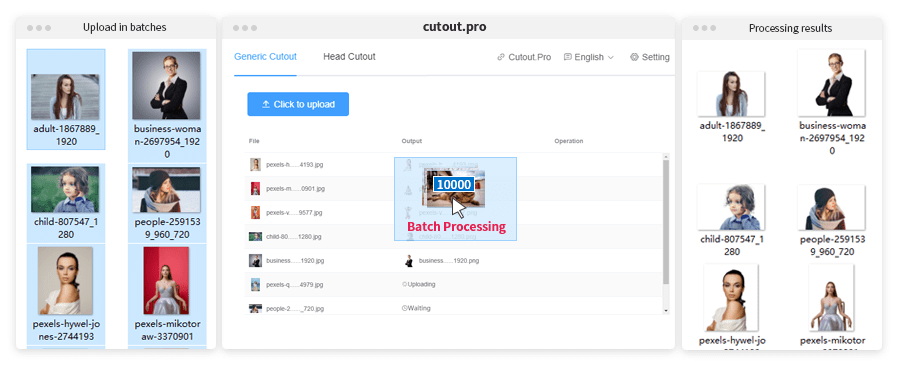
If your goal is to get a clean first cut fast, our Cutout. Pro is a good choice.
We focus on producing a reliable, hard-edge-friendly automatic cutout, so logos come out usable without manual masking or edge brushing. For teams handling lots of assets, it helps remove the background in one step.
Tools that work well (use what you have):
- Photoshop’s Remove Background in Properties or Select Subject, then Mask.
- Online removers:remove.bg API or Adobe Express Background Remover. For teams, an API stripes this into your workflow quietly.
- Vector-first: if you have the AI/EPS/SVG, export straight to transparent PNG. No removal needed. If I can stay vector until the last minute, I do.
My quick pass (January 2026):
- Check the source. If vector exists, export. If not, open in Photoshop.
- Run Remove Background. For small wordmarks, I prefer Select Subject + Mask because it treats edges more conservatively.
- Inspect at 200–300% zoom on a mid-gray canvas. If I see jaggies or halos, I sigh for half a second, then move to cleanup.
Time saved: on a batch of eight client logos, auto cutout + light cleanup averaged 3–4 minutes per logo. Old me would nudge for 20 minutes per piece. Past me was so serious.
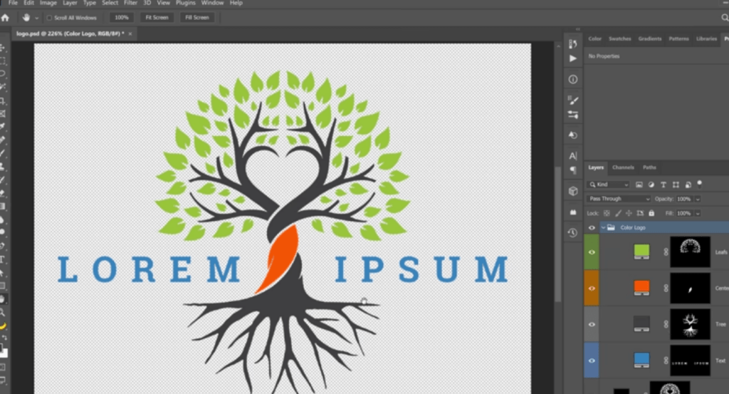
Edge Sharpening and Cleanup
This is the little polish that makes a transparent logo look expensive.
- Decontaminate Colors sparingly. It can help on white halos, but can also shift brand colors. I keep it under 10–20% and only on the mask edge.
- Contract and feather, micro-style. Mask > Select and Mask > Shift Edge -2 to -4% with Feather 0.2–0.4 px. Watch the preview: don’t go by the numbers.
- Hard-edge rescue. If your logo is pure vector shapes originally, aim for crisp anti-aliased edges, not soft blur. A 0.3 px Gaussian blur on the mask can fix stair-steps: more than that and it gets sleepy.
- Manual mop-up. A 100% hard round brush on the mask for straight edges: a slightly soft brush for curves. Zoom out often so you don’t over-clean.
I once spent 20 minutes nudging a shadow by hand… never again. Now it’s: two mask tweaks, a breath, and done. Well, that settled nicely.
Export Transparent PNG
Final export choices matter for where the logo will live:
- Transparent PNG-24, sRGB, no color profile surprises. Keep the canvas tight, extra padding can look off on dark backgrounds.
- For web/app, SVG is fantastic if the logo is vector-friendly and you don’t need complex texture. SVG stays razor-sharp at any size and keeps color precise. If you need PNGs, export the exact display sizes (1x/2x) to avoid scaling artifacts.
- If this feeds an automated pipeline, define output: PNG-24, transparent, sRGB, with a max edge (e.g., 1024 px longest side). For apps, I keep 512 px, 1024 px, and a tiny 128 px set ready.
Color Accuracy & Brand Safety
Brand colors carry weight. A two-point shift in cyan can make a logo feel off, even if most people can’t name why. Here’s how I keep color accuracy locked down when I remove background from logo files.
Prevent Color Shifts
- Work in sRGB for screen assets. It’s the common denominator for web. Reference: the W3C’s sRGB colorspace. Wide-gamut displays are lovely, but your audience mostly sees sRGB.
- Disable aggressive color decontamination on solid logos. It’s built for photos and hair, not flat fills. If you must use it for fringe removal, mask it selectively.
- Avoid double compression. Export once at final size. Re-exporting a compressed PNG can alter edge pixels and perceived color.
- Compare hex values. If the brand guide says #0A84FF, sample the exported PNG in a flat area. If you see #0A85FF, that’s usually fine: if you’re drifting multiple steps, investigate profiles or decontamination.
- Keep vector until the last possible moment. SVG preserves color definitions and avoids anti-alias blend issues.
I log small checks in my project notes, hex verification takes 10 seconds and saves revisions later. Mmm, that feels good.
Test on Light / Dark Background
I always drop the final PNG or SVG onto:
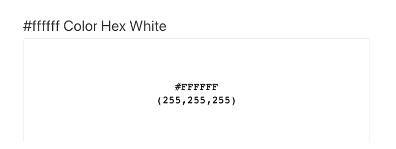
- Pure white (#FFFFFF)
- Pure black (#000000)
- Brand’s primary background (often a mid-tone)
I’m looking for: no halos, no ghost pixels, and consistent weight of strokes. On dark backgrounds, pale logos can appear thinner: sometimes I export a dedicated variant with a 0.25–0.5 px stroke expansion to keep visual weight consistent at small sizes.
Tiny but real: my jaw actually dropped a little the first time a client’s red mark looked brownish on a deep navy site. The fix was simple, ensure sRGB, re-export from vector, no decontamination, and poof, color snapped back. Ahh, that’s nicer.
Asset Pack Setup (Sizes + Naming)
A neat logo pack saves future-you. Here’s the set I bundle after every cutout, takes 5–7 minutes and prevents late-night scavenger hunts.
- Master: logo.svg (primary lockup, vector, sRGB intent)
- PNG transparent: logo-1024.png, logo-512.png, logo-256.png
- Wordmark-only and mark-only variants if the brand has them
- Light and dark variants: logo-light.svg/png, logo-dark.svg/png
- Favicon and app icons: favicon-32.png, favicon-48.png, apple-touch-icon-180.png, icon-512.png
- Social: logo-social-1200×630.png (Open Graph), logo-square-1080.png for profile images
- Naming: brandname-logo-primary-light@1x.png and @2x where relevant. Consistency beats cleverness.
For teams and dev workflows, I keep an /exports and /sources folder, plus a simple readme with color references and usage notes. If you’re automating via an API), define deterministic outputs in code so everyone gets the same crisp assets without manual touches.
There… feels gentle, doesn’t it?
Previous posts:
Transparent Background PNG: How to Export Cleanly (No Artifacts)
Fur & Hair Background Removal: How to Get Natural Edges
Bulk Background Removal: 100+ Images Fast (Workflow & QA)