
Hello! I’m Camille. Last Thursday night I was sitting with 62 product photos from a client — half shot under warm kitchen lights, the other half by a window on an overcast afternoon. Same product, two different worlds. One batch looked like it was dipped in tea; the other had that cold hospital-blue thing going on. The deadline was the next morning. If you’ve ever been the person quietly cursing a catalog at 11 p.m. because the colors refuse to match, this one is for you.
I’m going to walk you through how I now handle this kind of mess with photo color correction online — the AI-assisted kind — when a full manual edit isn’t worth the hours. We’ll cover what actually causes color problems, when auto-correction is enough, when to step in manually, and how to keep a whole product catalog looking like it came from one photographer. Grab a coffee. This one saved my night.
What causes color problems in photos
Before you fix anything, it helps to know why the color went sideways. Otherwise you’re just dragging sliders and hoping.
Yellow cast from indoor / tungsten lighting
Indoor bulbs usually sit around 2700K–3000K, which the camera reads as warm. Your eyes adjust automatically; the sensor doesn’t. That’s where the yellow tea-bath look comes from. The fix isn’t “less yellow” — it’s rebalancing the white point so neutrals actually look neutral again.
Blue tint from overcast or shade
Shot under clouds or open shade, images drift cool — often 7000K+. Skin starts looking like it needs a blanket. Product whites turn faintly icy. Mm, not the vibe.
Dull, flat tones from phone cameras
Phones auto-smooth a lot. Contrast gets compressed, saturation gets averaged, and the result is that “nice enough but meh” look. Not broken — just tired.
Inconsistent color across a product catalog
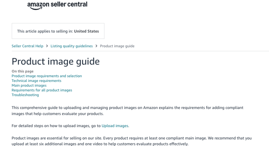
This one’s the quiet killer. Each shot might look fine alone, but line them up on your storefront and the whole thing feels sloppy. Amazon, for example, is fairly specific about this — their product image requirements expect consistent, true-to-life color across listings, and shoppers notice even when they can’t articulate it.
Auto color correction vs manual editing
Here’s where I used to overthink things. Past me would have opened every single image in Photoshop. Don’t copy old me — truly.
What the AI detects and adjusts automatically
Modern auto color correction reads the image for three things: white balance (is the neutral actually neutral?), exposure (is anything clipping in highlights or shadows?), and saturation curves (is the color story flat or oversaturated?). Then it nudges each one toward a reference of how a “correctly exposed, neutrally lit” version of that image would behave. For most product shots and everyday photos, this pass alone gets you 80–90% of the way.
When you still need manual control
Auto isn’t always right. Two cases where I still go in manually: mixed lighting (window light + warm lamp in the same frame — AI picks one and the other half looks wrong), and brand-specific color where the product itself is a very particular shade that the AI tries to “correct” into something more generic. If the product’s navy blue keeps coming out cobalt, that’s the moment to take the wheel. Adobe’s own color and white balance guidance is a good reference if you want a deeper feel for what “manual correction” actually means under the hood.
Step-by-step: fix photo color with Cutout.Pro
Okay, here’s the actual workflow I used on those 62 photos. Tested in late March 2026.
Upload → auto-correct → compare before/after
- Open photo color correction and drop the image in.
- Let the auto pass run — it’s usually under 5 seconds per image.
- Use the before/after slider. This is the step most people skip, and it’s the one that saves you. Your eyes calibrate fast; without the slider you forget what the original even looked like.
That’s the base flow. One pass. No back-and-forth grinding.
Fine-tuning hue, saturation, and exposure
After auto, I check three things in this order:
- Whites: zoom into a white or gray area. If it still leans warm or cool, nudge temperature first.
- Skin and product color: these should look like themselves, not a slightly different version.
- Shadow detail: if shadows went muddy after correction, lift them a touch. If highlights clipped, pull exposure down 5–10%.
Small moves. If you find yourself making big moves, the original probably needs a reshoot, not a rescue.
Export settings for web vs print

For web, export sRGB + JPEG at quality 85–90 for product shots, or WebP if your platform supports it. For print, export Adobe RGB or the printer’s ICC profile, as TIFF or PNG. Mixing these up is one of the most common reasons “the color looked fine on my screen but wrong on the site” — the W3C’s sRGB color space reference is the short version of why.
Product catalog color consistency at scale
This is where batch workflows earn their keep.
Batch color correction for e-commerce
Upload your whole folder, run the same correction profile across every image, then do one quality-check pass on a sample of 5–10 before exporting the rest. What used to take half a day now takes about 15 minutes for 50–60 images. That saved enough time for dinner, which — quietly speaking — I was very pleased about.
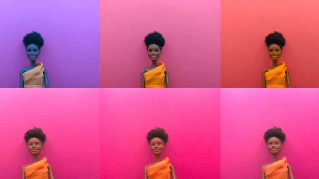
Keeping consistent look across SKU variations
For color variants of the same product (same shirt in six colors, for example), shoot them all in the same session under the same light if you can. Then correct them as a batch, not one by one. Even with auto-correction, small session-to-session drift sneaks in. Treat a variant set as one unit. If one image in the set needs manual adjustment, check that the others still match it afterward — don’t fix one and forget the rest.
Honestly? This single habit — batch-as-a-unit — fixed about 80% of the “catalog looks uneven” complaints I used to get from clients.
FAQ
Q1: Can it fix photos shot under mixed lighting? Partially. Auto correction picks one light source to neutralize, so the other half of the frame may still look off. For mixed lighting, expect to do a manual pass after the auto correction, or reshoot under one consistent source if you can.
Q2: Will it change skin tones unnaturally? Not usually, but always spot-check. Strong color casts in the original (heavy yellow or green) can push skin toward pink or orange during correction. If that happens, reduce the correction strength rather than pushing skin tones back manually — you’ll get a cleaner result.
Q3: Does it work on product photos on white backgrounds? Yes, and this is actually one of the clearest use cases. The white background gives the AI a reliable neutral reference, so white balance lands accurately. If the “white” background is slightly gray or cream in the original, correction will make it properly white — which usually helps for marketplace uploads.
Q4: Can I batch-correct a folder of photos? Yes. Batch processing is available and handles mixed-scene sets reasonably well. The honest caveat: if your batch contains very different lighting conditions (some outdoor, some indoor), run them as separate sub-batches. Results are more consistent that way.
Q5: Is the correction reversible? Always keep your originals. The corrected file is a new export — the original isn’t modified — but you want the raw source somewhere safe in case you need to redo anything down the line. An old habit. Still working on making peace with it, but it’s saved me more than once.
Alright, that’s the workflow. If this rescued my brain at 11 p.m. with 62 photos, it’ll probably handle whatever’s sitting in your folder right now. Try it on five images first, see how the auto pass lands, and adjust from there. See you next time — may your whites stay white and your blues stay on brand.
Previous Posts:
How to Animate Photo to GIF Online (Free, No App Needed)
How to Use Seedance 2.0 Text to Video: Step-by-Step Guide for Beginners
How to Remove Background on iPhone in 30 Seconds (iOS 18, No App Needed)
Remove Background Online in Under 10 Seconds (No Sign-Up, Transparent PNG)
Face Cutout & Bighead Maker: Create Stickers and Photo Props in 1 Minute